

A Alumio vivid purple arrow pointing to the right, a visual representation of how to access more page material when clicking on it.
Go back

Top modern fonts for your WordPress website in 2023

By
Published on
May 28, 2023
Updated on
June 24, 2026
IN CONVERSATION WITH
Email icon
Email icon

Welcome to our extensive guide on the most exceptional modern fonts to elevate your WordPress website in 2023! We will delve into a wide array of fonts that cater to various styles and purposes, ensuring your website stands out from the crowd.

Why Choosing the Right Font Matters

The right best font for your WordPress website is crucial in conveying your brand identity and creating a lasting impression on your visitors. Fonts can evoke emotions, set the mood, and influence user experience. In this guide, we have curated an exclusive selection of modern fonts that will not only enhance your site's aesthetics but also improve readability and user engagement.

Sans Serif Fonts: Clean and Modern

Sans serif fonts are known for their clean, minimalistic appearance, making them perfect for modern websites. Here are some top sans serif fonts to consider:

  1. Roboto: Created by Google, Roboto is a versatile and highly legible font. Its geometric shapes and friendly curves make it suitable for various applications, from headlines to body text.
  2. Open Sans: Another popular Google font, Open Sans, is optimized for both web and print use. Its open forms and neutral appearance ensure excellent readability on screens of all sizes.
  3. Montserrat: Inspired by traditional signage in Buenos Aires, Montserrat is a geometric sans serif with a modern, urban edge. Its bold, distinctive character makes it perfect for headlines and branding.
  4. Raleway: Originally designed as a single-weight font, Raleway has since been expanded into a versatile family of nine weights. Its elegant, geometric design works well for headlines, logos, and other display text.

Serif Fonts: Sophistication with a Contemporary Twist

Serif fonts often evoke a sense of tradition and sophistication. Here are some modern takes on serif fonts that maintain their classic charm:

  1. Playfair Display: Drawing inspiration from the 18th-century typefaces, Playfair Display combines traditional and modern elements. Its high contrast and vertical stress make it perfect for headlines and large text.
  2. Merriweather: Designed for screens, Merriweather is a highly readable serif font that boasts large x-height and slightly condensed letterforms. It works well for body text and headlines.
  3. Vollkorn: A robust and versatile font, Vollkorn is characterized by its dark, sturdy letterforms and elegant details. It is an excellent choice for both body text and display purposes.


Turn AI ambition into action

Portrait of Leonie Becher Merli, Business Development Manager at Alumio

Get a free assessment of your integration needs and next steps

Portrait of Leonie Becher Merli, Business Development Manager at Alumio

Display Fonts: Making Bold Statements

Display fonts are designed to grab attention and make a statement. Here are some unique, eye-catching options for your website:

  1. Abril Fatface: Inspired by heavy titling fonts used in advertising posters in the 19th century, Abril Fatface exudes a bold, dramatic flair. Its high contrast and distinctive curves make it perfect for headlines and branding.
  2. Bebas Neue: A popular all-caps font, Bebas Neue is characterized by its tall, condensed letterforms. It is an excellent choice for headlines, logos, and other display applications that require a strong visual impact.
  3. Oswald: Inspired by classic sans serif fonts like Alternate Gothic, Oswald has been reimagined for the digital age. Its narrow, condensed style is ideal for headlines, banners, and other instances where space is limited.

Handwritten Fonts: Adding a Personal Touch

Handwritten fonts can inject personality and warmth into your website. Here are some top choices to consider:

  1. Pacifico: With its casual, flowing script style, Pacifico adds a touch of whimsy and charm to your website. It's well-suited for headlines, logos, and other display text.
  2. Amatic SC: A quirky, condensed font, Amatic SC is perfect for adding a playful and informal vibe to your site. Its hand-drawn appearance works well for headlines and short pieces of text.
  3. Dancing Script: As its name suggests, Dancing Script has a lively, rhythmic feel that evokes the fluid motion of dance. Its elegant, flowing letterforms make it a popular choice for branding, headlines, and invitations.

Integrating Fonts and Alumio

When you've selected the perfect modern fonts for your WordPress website, it's essential to ensure seamless integration with your other tools, systems and WordPress integrations. Alumio, a cutting-edge integration platform, can help streamline the process. By offering flexible integration solutions, comprehensive project support, and access to a knowledgeable development team, Alumio enables you to create a cohesive digital experience that aligns with your brand and captivates your audience.

No items found.
Topics in this blog:
No items found.

FAQ

Integration Platform-ipaas-slider-right
Why does font choice matter for a WordPress website?

Font choice affects how visitors perceive your brand, how readable your content is, and how your site performs. A well-chosen font communicates professionalism, reinforces brand identity, and makes content easier to scan across screen sizes. Poorly chosen or inconsistently applied fonts create a visually fragmented experience. Web font loading also affects page performance: loading multiple heavy font families adds to page weight and can affect Core Web Vitals, particularly Largest Contentful Paint on pages with large text headings.

Integration Platform-ipaas-slider-right
What is the difference between serif, sans serif, and display fonts for web use?

Serif fonts (like Georgia or Merriweather) have small decorative strokes at the ends of letterforms and convey tradition, authority, and editorial character. Sans serif fonts (like Roboto, Inter, or Open Sans) have clean, unadorned letterforms that read as modern, neutral, and highly legible on screens. Display fonts are designed for large headings and brand statements rather than body text. For most business websites, a sans serif body font with a contrasting heading font creates a clear typographic hierarchy.

Integration Platform-ipaas-slider-right
What are the best font options for a modern WordPress business website?

Widely used and well-performing fonts for modern WordPress business sites are Inter and Roboto for clean, neutral body text; Plus Jakarta Sans and DM Sans for a slightly distinctive but professional feel; Playfair Display or Lora for editorial headings that contrast with a sans serif body; and Montserrat for geometric, brand-forward headings. Google Fonts hosts most of these at no cost. The practical test is whether the font is readable at 16px body size on mobile and loads quickly within your page weight budget.

Integration Platform-ipaas-slider-right
How do you add custom fonts to a WordPress website?

The main methods for adding custom fonts are: using Google Fonts (referenced via a URL in the theme or via a plugin like OMGF for local hosting), self-hosting font files uploaded to the theme's fonts directory and referenced in style.css, or using a font plugin like Easy Google Fonts or Typekit for Adobe Fonts. Local hosting via OMGF is recommended for performance and GDPR compliance, as it eliminates a third-party request to Google's servers.

Integration Platform-ipaas-slider-right
How does font loading affect WordPress page performance?

Web fonts loaded from external sources add DNS lookup and connection overhead to each page load. Flash of Invisible Text (FOIT) or Flash of Unstyled Text (FOUT) can occur while fonts load, degrading the visual experience and affecting Cumulative Layout Shift scores. Best practices are to use font-display: swap to show a fallback font immediately while the web font loads, preconnect to the font provider's domain, and limit the number of font variants loaded to only those actually used on the page.

Integration Platform-ipaas-slider-right
How many fonts should a WordPress website use?

Most design systems for business websites use two fonts: one for headings and one for body text. Using three is acceptable when a monospace or accent font is needed for a specific content type. Beyond three, typographic consistency breaks down and performance overhead grows. Each additional font family and weight adds to HTTP requests and total page weight. The practical discipline is to define a typography scale in the theme's CSS with the minimum number of fonts and weights needed, rather than loading fonts reactively as design needs arise.

Get a free assessment of your integration needs

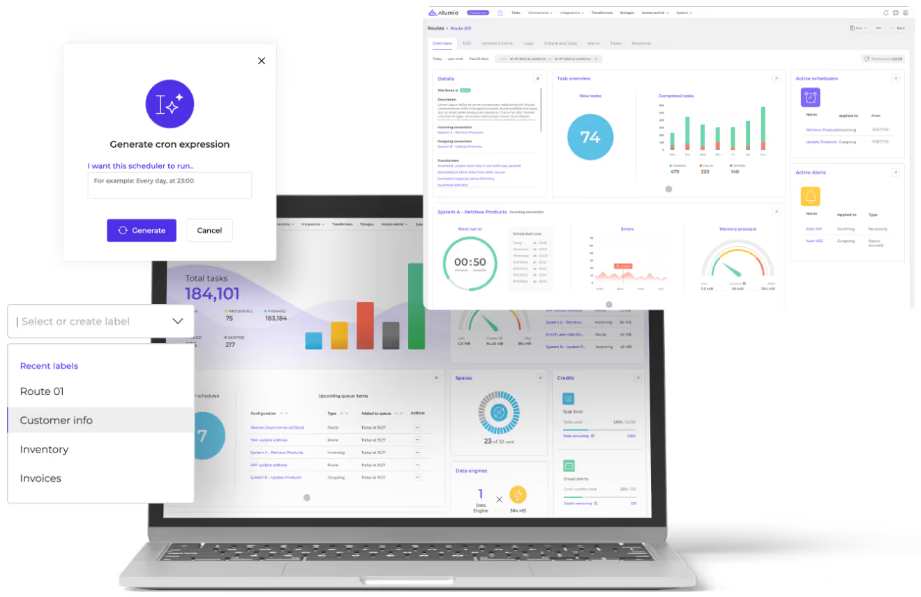
Laptop screen displaying the Alumio iPaaS dashboard, alongside pop-up windows for generating cron expressions, selecting labels and route overview.