




.svg)



New iPaaS dashboard: real-time integration control
For integration-heavy businesses, the dashboard is the pulse check of their integration environment and digital ecosystem. It’s the place where teams monitor system health, track performance, and catch issues before they escalate. Alumio's dashboard has always served this critical role, providing essential visibility into task statuses, route performance, and integration health. But as integration environments grow more complex, with interconnected systems processing higher data volumes in real-time, teams need more than basic status updates. They require actionable intelligence.
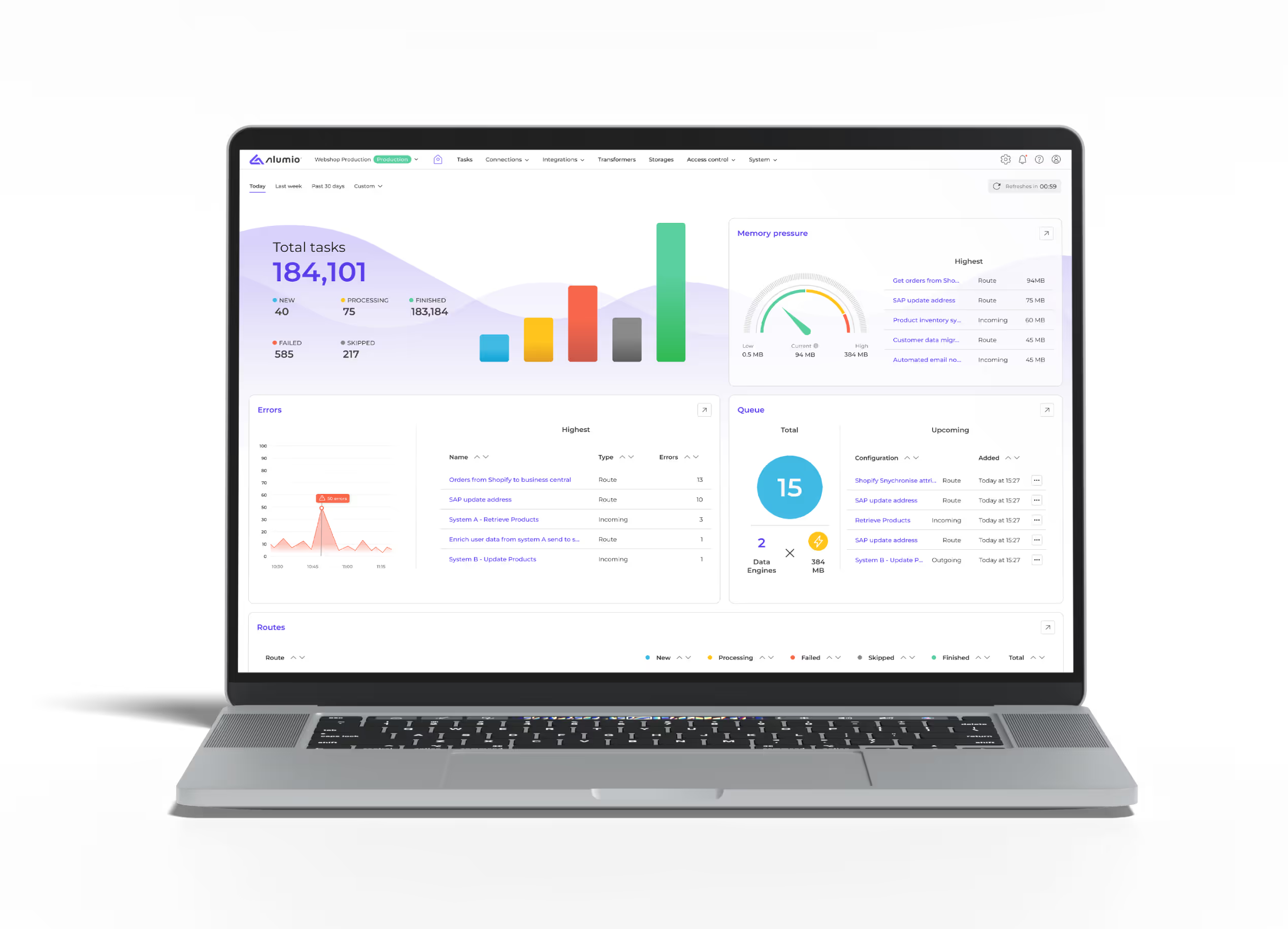
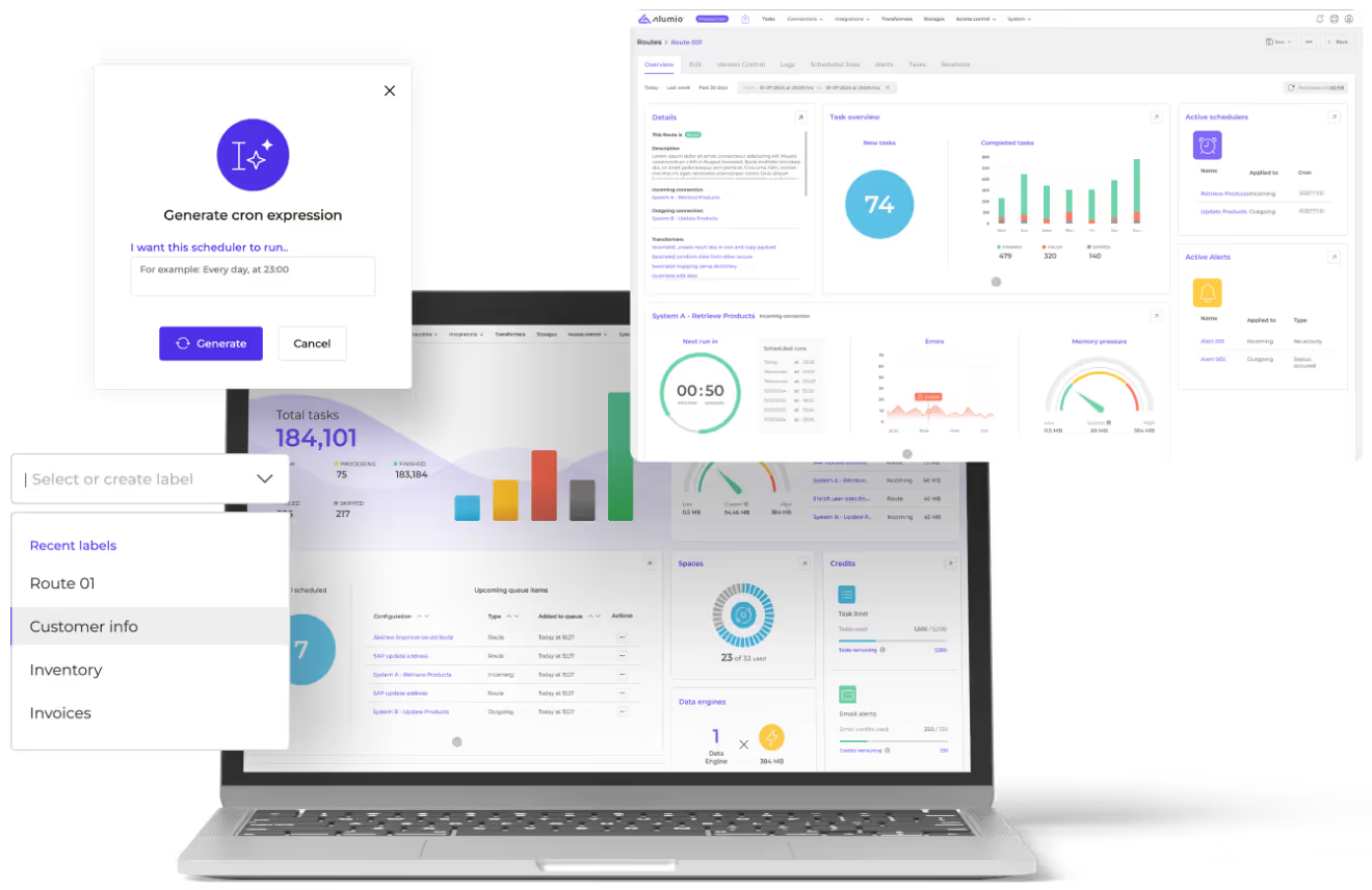
Building on the strong foundation of our old dashboard, the redesigned Alumio dashboard widens the scope of what’s visible at a glance: memory pressure, error statistics, data engine usage, queue monitoring, disk and filesystem capacity, and credit limits now sit alongside routes and tasks in a clean, unified view. This evolution makes it easier for IT teams, system integrators, and business users to move from simply viewing system health to actively managing and optimizing it, all within a unified, intuitive interface.
Introducing the new Alumio integration platform dashboard:
What makes the new dashboard a game-changer for integrations?
The redesigned Alumio dashboard provides a comprehensive operational overview that auto-refreshes every 5 minutes or can be refreshed instantly on click. Our flexible date-filtering system on the dashboard, which allows you to see the state of your integrations today, last week, the past 30 days, or within custom time windows, now updates across a host of new metrics.
In other words, instead of needing to navigate multiple screens to piece together integration history and health, the dashboard has expanded to include new essential metrics along with the old ones on a single, user-friendly page.
1. Task status at a glance

Real-time task statistics for new, processing, finished, failed, and skipped operations are now also visualized in bar graphs, which make performance trends immediately visible as you filter by date. When task volumes spike, processing slows unexpectedly, or if tasks start to fail, teams can directly intervene before customers experience delays or downstream systems are affected. This granular visibility transforms task monitoring from periodic check-ins to continuous operational awareness.
2. Route-level insights

This allows you to see your recent routes and track the progress of your workflows across different task statuses more effectively. With clearer visualizations and sortable columns, the redesigned view makes it easier to spot patterns and performance issues at a glance. This allows you to see how your recent routes are performing and prioritize fixes or optimizations based on business-critical processes, whether it’s an order fulfillment workflow or a customer data enrichment process. We've also made the route table span wider to improve readability for longer route names.
3. Error detection and resolution
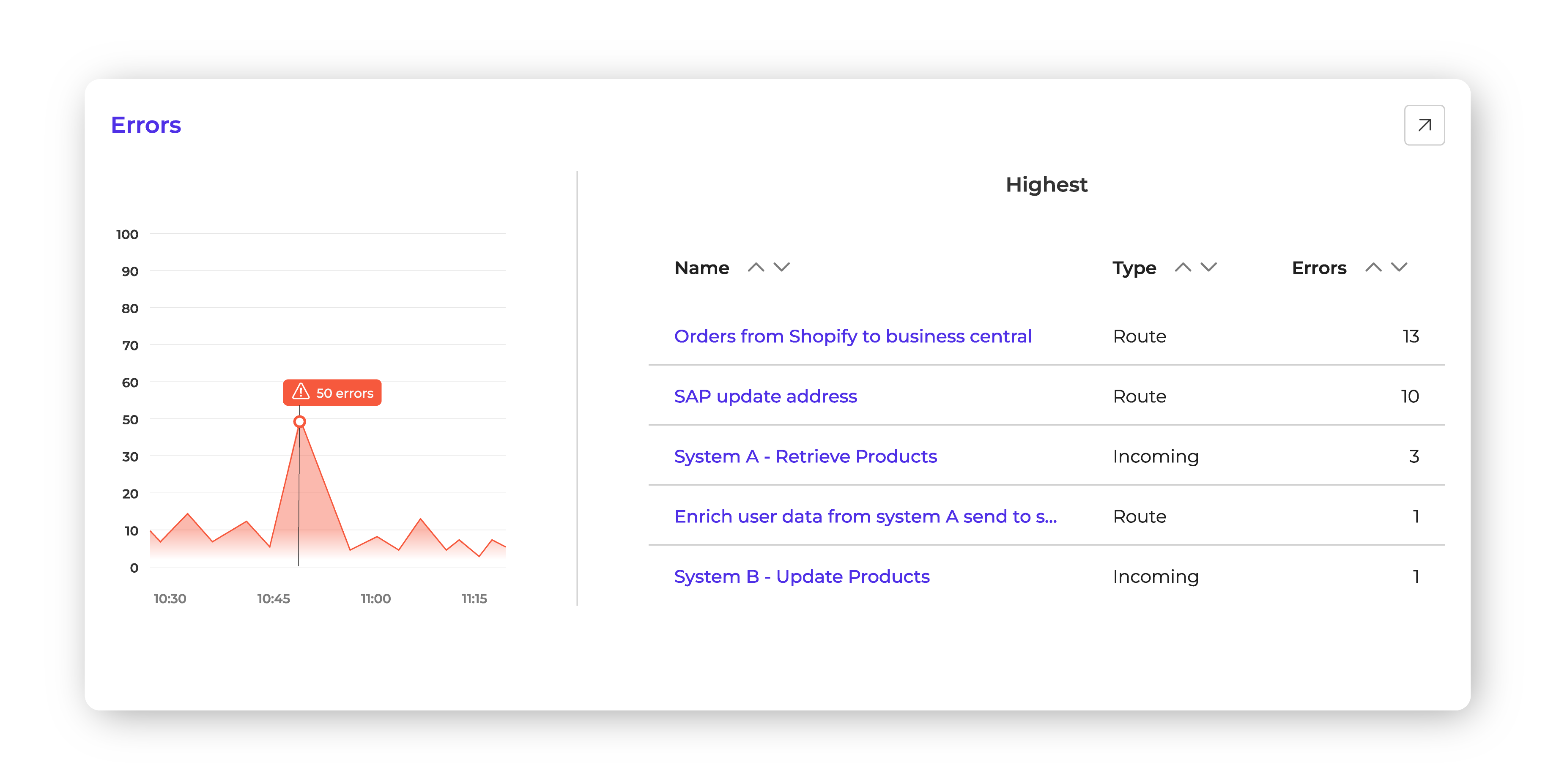
Our new dedicated errors panel for the dashboard highlights configuration or route-level issues, showing both frequency and type. It displays spikes and trends caused by upstream system downtime, newly required API fields, or configuration errors, so you immediately see red to alert you when something’s off. From there, you can jump straight into the relevant configuration and logs to see what changed and why. For example, if an SAP update address route is failing due to an authentication change, you’ll spot it instantly and can take corrective action before it causes data mismatches.
New features to optimize integration performance and resource usage
Beyond improvements to the route overview, task status, and error monitoring from before, the new Alumio dashboard now delivers key operational intelligence:
4. Memory pressure tracking

We’ve now added a visually appealing memory pressure gauge animation, which shows which routes or configurations are consuming the most resources. For example, if a product synchronization process from your PIM (Product Information Management) system is using more memory than expected, you can adjust its scheduling or optimize its transformations to prevent slowdowns.
5. Queue items and Data Engine usage

The dashboard now previews the Alumio queue and which integrations are lined up to be processed by available data engines. This section gives teams early visibility into upcoming workload, showing the number of items currently in the queue and real-time data engine usage. This visibility helps teams instantly gauge load, anticipate slowdowns, and decide whether to scale capacity with additional data engines or reschedule workflows. Whether it’s preparing for a seasonal sales spike or managing a bulk data migration, the combination of queue insights and data engine usage gives integration teams the control they need to keep processes flowing smoothly.
6. Database and filesystem usage
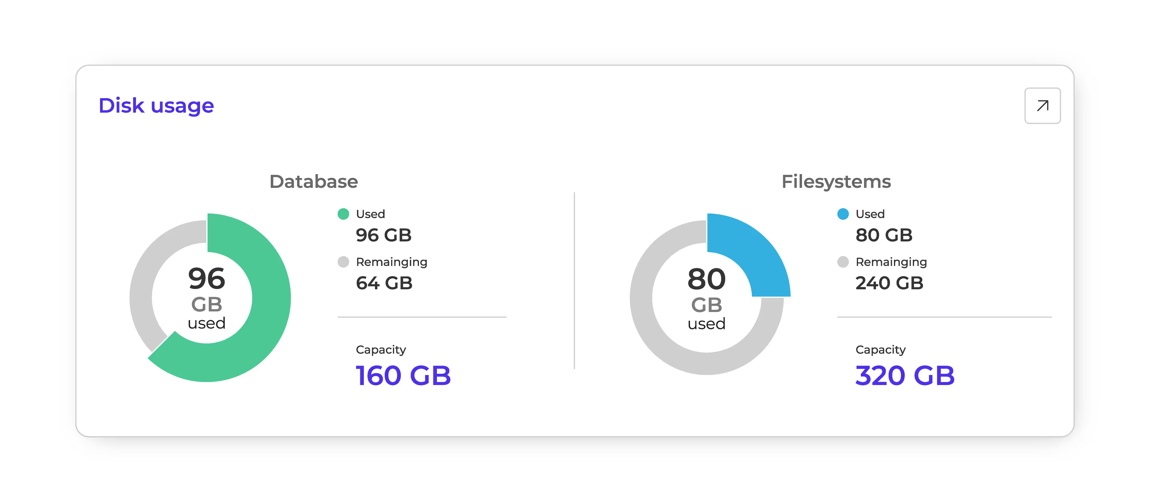
The dashboard now gives a clear breakdown of how much database and filesystem storage is in use versus what remains. This makes it easy to see when you’re approaching capacity and plan ahead—whether that means cleaning up unused data or expanding storage capacity. Instead of discovering space issues mid-operation, teams get an early warning system that allows them to plan ahead and keep integrations running without disruption.
7. Credit limits for tasks and alerts
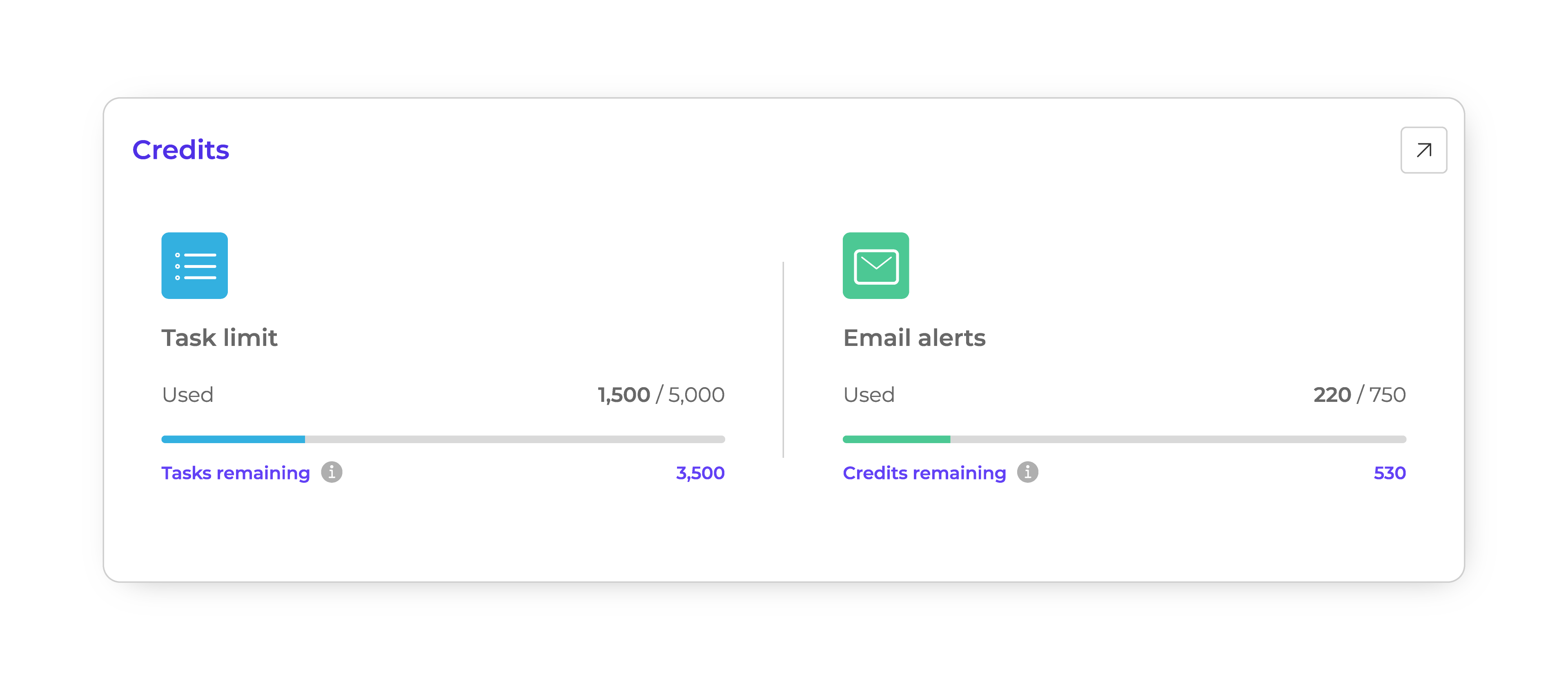
In Alumio, the task execution limit (unless you have a plan with unlimited tasks) and email alert notifications you trigger, both run on credit systems. While these limits vary depending on your license, the Alumio dashboard now tracks how many credits you’ve used and how many remain, so you know exactly how much runway is left. This foresight helps teams adjust workloads, schedule heavier jobs smartly, or optimize how error notification email alerts are scheduled.
Navigation that stays out of the way
Core Alumio navigation remains familiar at the top, letting the redesign focus on what matters most: clearer visuals, broader operational context, and shorter paths from signal to action.
Reimagining integration management and orchestration
With this redesign, the Alumio dashboard moves closer to becoming a full orchestration hub — not just reporting on integration health, but enabling proactive performance tuning and workflow optimization. As more automation and intelligence layers are introduced, the dashboard will continue to evolve into a central command center for the modern integrated enterprise.
By structuring the dashboard around decision-making rather than just data display, the new Alumio dashboard makes it easier for teams to:
- Detect and respond to integration issues in real time
- Keep track of and optimize high-volume routes faster
- Avoid resource overuse and prevent service interruptions
In other words, the redesigned Alumio dashboard helps push teams from reactive troubleshooting to proactive performance management. By widening visibility and putting next actions one click away, it shortens time-to-resolution and promotes efficient resource usage. As your integration landscape grows, it will be the foundation for smarter orchestration, stronger SLAs, and confident scaling.
And so, for businesses where uptime, accuracy, and integration speed are non-negotiable, this update isn’t just a UI refresh — it’s a strategic advantage.





.svg)
.svg)
.svg)
.svg)
.svg)
.svg)
