
Dashboard walkthrough
The Alumio dashboard is the control center for your integration ecosystem. As a cloud-native web environment, it can be securely accessed from any browser, giving you real-time visibility into every connection you’ve built. But before each element on the dashboard makes sense, it helps to first understand how Alumio creates, monitors, and manages integrations.
Understanding Alumio’s integration process via the dashboard
At the heart of Alumio’s integration process are two concepts: Routes and Tasks.
- Routes are the blueprints of your integrations. They define exactly how data should move from one system to another, what conditions are applied along the way, and how often the process should run. For instance, a Route may import customer records from your webshop, transform them into the right format, and export them into your CRM.
- Tasks are the measurable outcomes of those instructions being carried out. Each time a Route runs, it generates Tasks, which are then tracked as New, Processing, Finished, Failed, or Skipped. In our example, a Task measures each individual customer record moving from the webshop into the CRM, tracking whether it’s newly imported, currently in transit, successfully delivered, failed due to an error, or skipped as a duplicate.
In other words, while Routes help define and manage the flow of data between applications, Tasks help you track, monitor, and troubleshoot each step of the data integration process. Surrounding these two highlights on the dashboard, you'll see several other essential metrics like the Errors graph, Queue, Memory pressure, Disk usage, and Credits, which help track and troubleshoot errors swiftly, optimize overall performance, and monitor system health.
We will have other courses explaining in detail how Alumio helps make integrations simple via Routes, Tasks, Schedulers, and Transformers. However, now that we’ve understood the Alumio integration process, it will provide better context for us to walk through each element on the dashboard and how it helps you measure, monitor, troubleshoot, and optimize your integrations.
A quick walkthrough of the Alumio dashboard
The Alumio dashboard provides a comprehensive operational overview of all your integrations, which auto-refreshes every 5 minutes or can be refreshed instantly on click for live status. Our flexible date-filtering system on the dashboard, which allows you to see the state of your integrations—today, last week, past 30 days, or within custom time windows—reflects across a host of new metrics.
In other words, instead of navigating multiple screens to piece together your integration history and health, system integrators now have one centralized view that shows exactly what's happening right away and what to do next. The Alumio dashboard brings together all the key integration metrics that matter into one user-friendly interface:
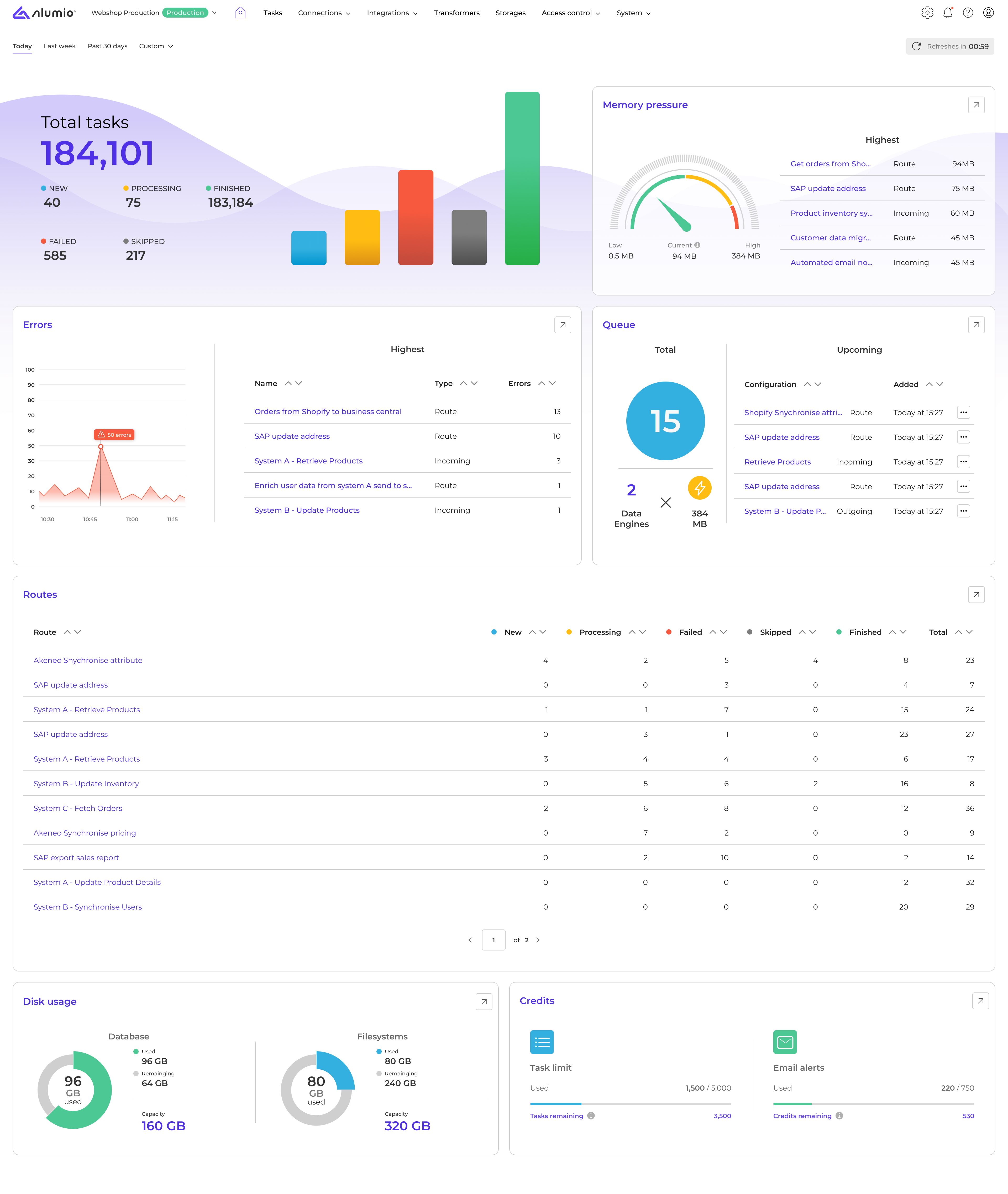
1. Task statistics
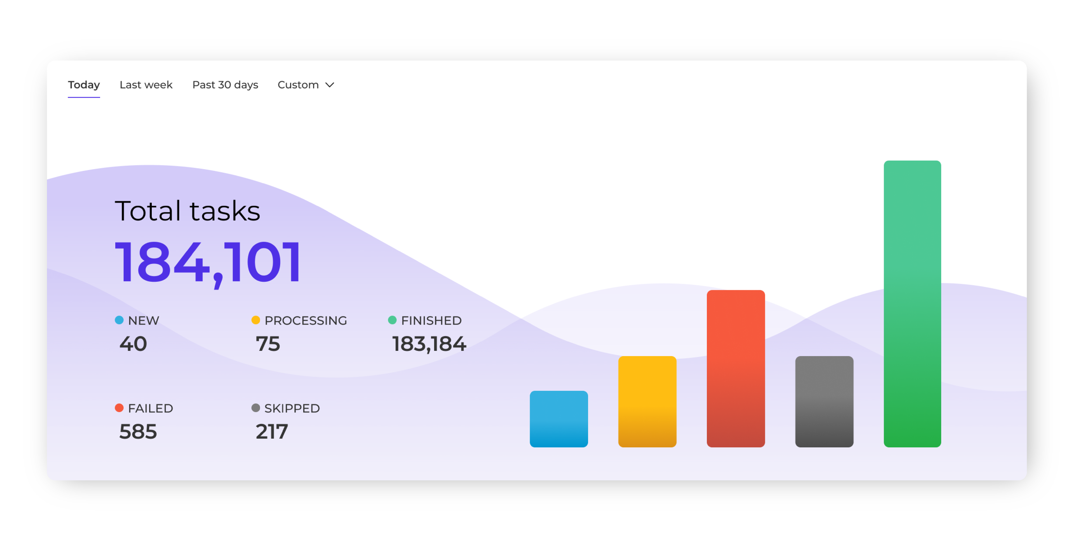
This section displays the total number of integration Tasks you’ve generated within Alumio and the different states of these Tasks:
- New Tasks: Displays data that has been imported into Alumio from a source application but has not yet been processed or sent to a target application.
- Processing Tasks: Shows Tasks that are actively being processed in the queue to be sent to the target application according to the configured schedule.
- Finished Tasks: Confirms that data has been successfully processed and delivered to the target application without errors.
- Failed Tasks: Highlights Tasks that encountered issues during processing, with error logs available for troubleshooting or the option to retry integrations.
- Skipped Tasks: This lists Tasks that were intentionally ignored due to filtering rules, duplicate detection, or manual exclusions, ensuring only relevant data is processed.
When Task volumes spike, processing slows unexpectedly, or if Tasks start to fail, teams can directly intervene before customers experience delays or downstream systems are affected. This granular visibility transforms Task monitoring from periodic check-ins to continuous operational awareness.
We’ll explore why Alumio helps measure and track Tasks according to these different states in our next course about “Integration Tasks” in detail. And how it helps systematically streamline and enrich the flow of data via the Alumio iPaaS.
2. Route overview
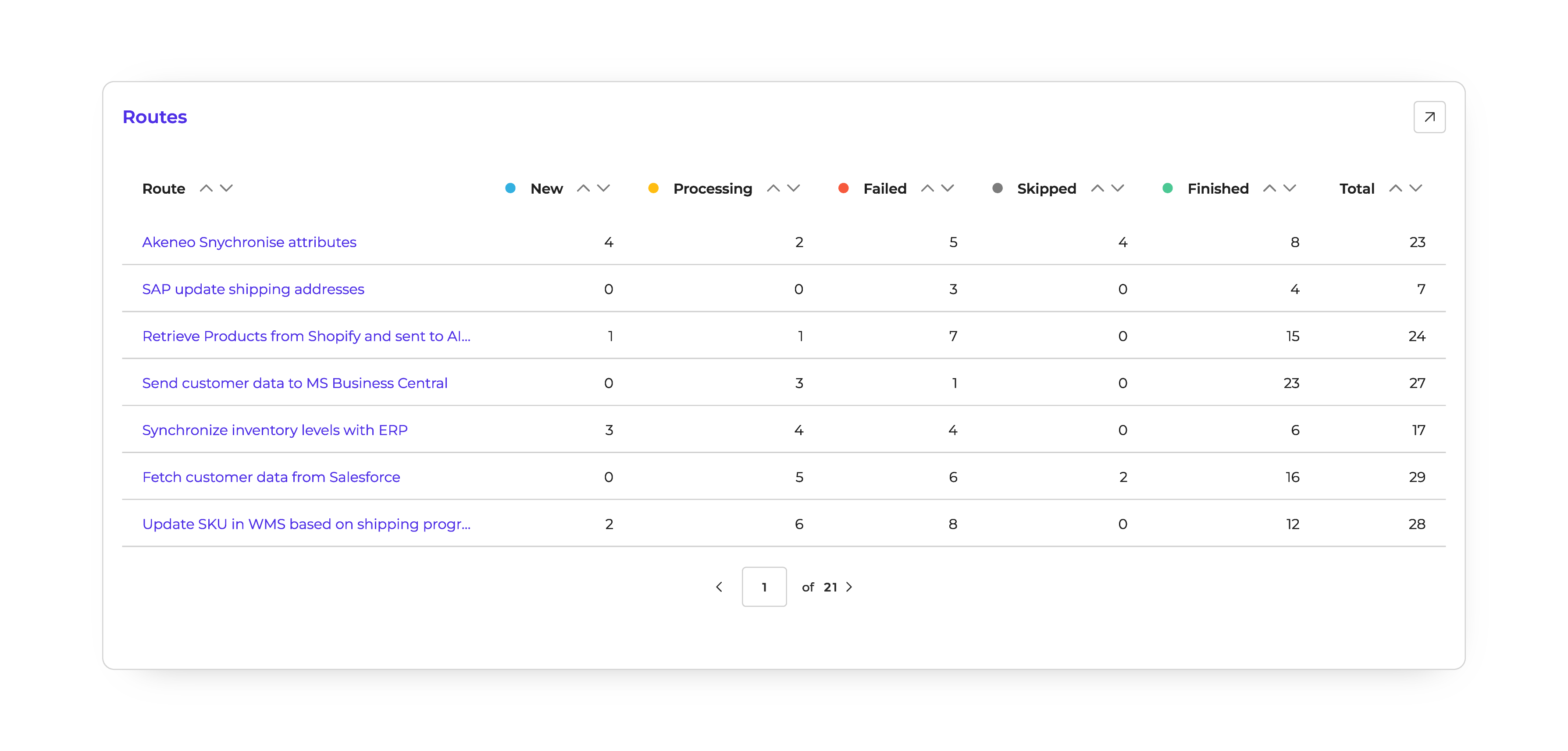
The Route overview gives you a clear view of all your running Routes and their performance. The table lets you view Routes by the Tasks they generate and their status. In other words, you can see the number of Tasks that a Route has created, processed, failed, skipped, or finished. You can easily filter Routes by these statuses to focus on specific data flows and troubleshoot any issues.
For example:
Imagine you have a Route that syncs product attributes from your PIM (Akeneo) into another system, such as your webshop or ERP. In the overview, you might see:
- 4 New Tasks (new attribute records pulled in from Akeneo, waiting to be processed)
- 2 Processing Tasks (attribute updates currently being transferred to the target system)
- 8 Finished Tasks (attributes successfully synchronized without errors)
- 5 Failed Tasks (records that couldn’t be processed, perhaps due to missing values or schema mismatches)
- 4 Skipped Tasks (attributes ignored because they were duplicates or didn’t meet filtering rules)
By filtering the table, you could quickly isolate the failed Tasks to investigate errors, or review skipped ones to ensure important attributes aren’t being excluded unnecessarily.
3. Errors graph
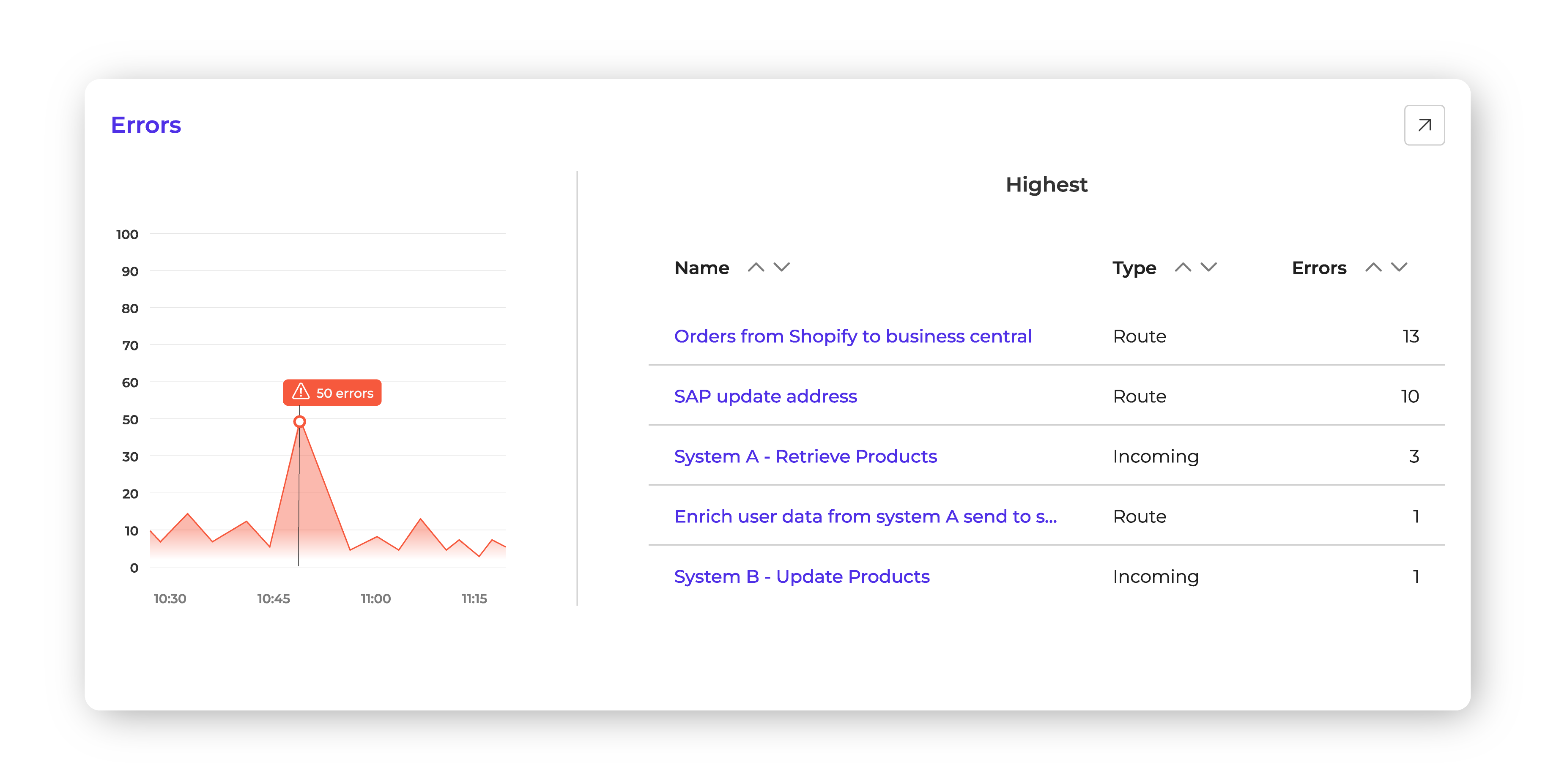
Our dedicated errors panel for the dashboard highlights configuration or Route-level issues, showing both frequency and type. It displays spikes and trends caused by upstream system downtime, newly required API fields, or configuration errors, so you immediately see red to alert you when something’s off. From there, you can jump straight into the relevant configuration and logs to see what changed and why. For example, if a Route to update addresses in SAP is failing due to an authentication change, you’ll spot it instantly and can take corrective action before it causes data mismatches.
4. Queue and Data Engine usage
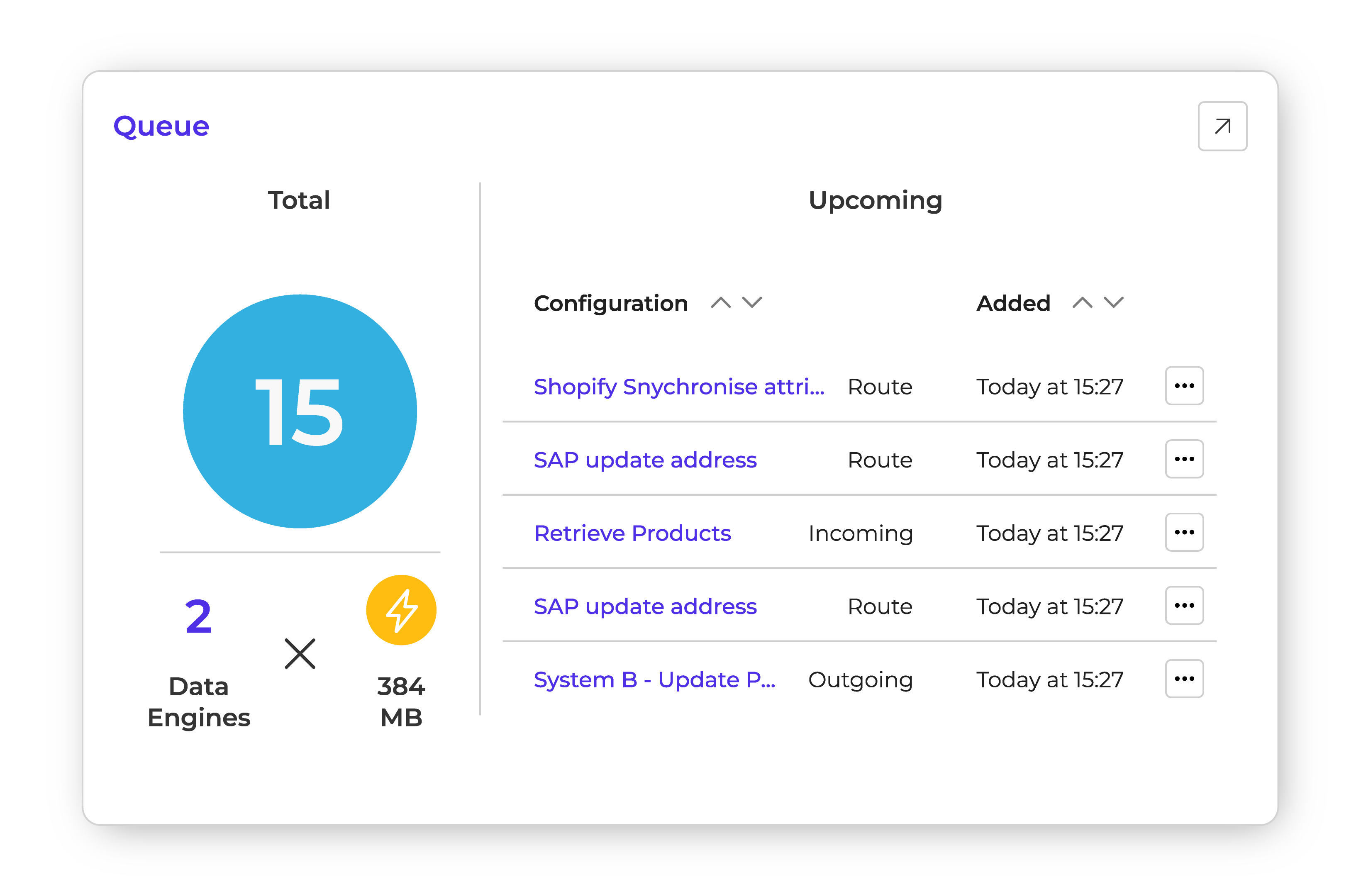
This section previews the integration queue, showing which integrations are lined up to be processed by available Data Engines. It gives teams early visibility into upcoming workload, including the number of items currently in the queue and real-time Data Engine usage. This visibility helps teams instantly gauge load, anticipate slowdowns, and decide whether to scale capacity with additional Data Engines or reschedule workflows. Whether it’s preparing for a seasonal sales spike or managing a bulk data migration, the combination of queue insights and Data Engine usage gives integration teams the control they need to keep processes flowing smoothly.
5. Memory pressure
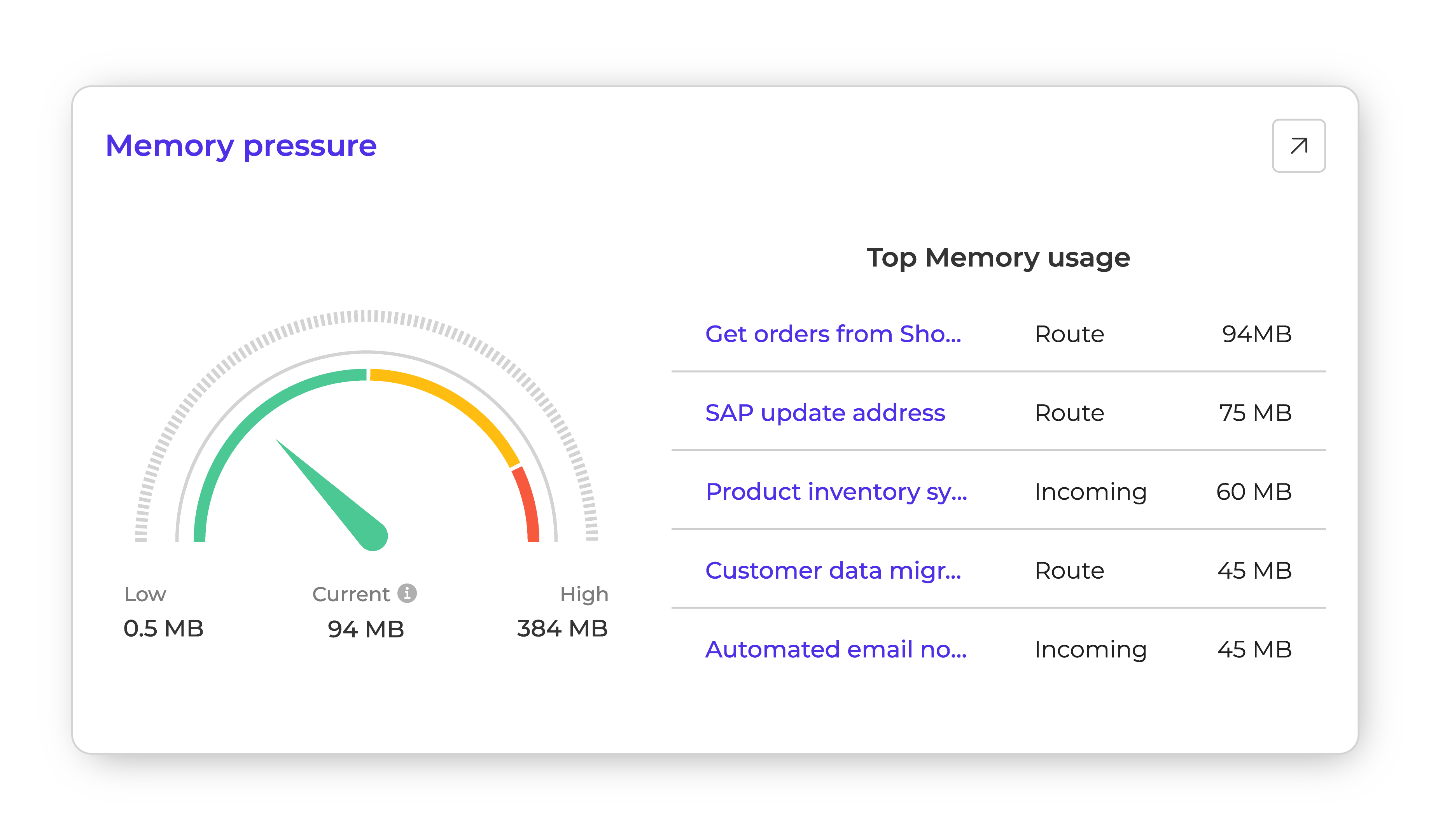
The memory pressure gauge shows which Routes or configurations are consuming the most resources. For example, if a product inventory synchronization process from your PIM (Product Information Management) system is using more memory than expected, you can adjust its scheduling or optimize its transformations to prevent slowdowns.
6. Disk usage
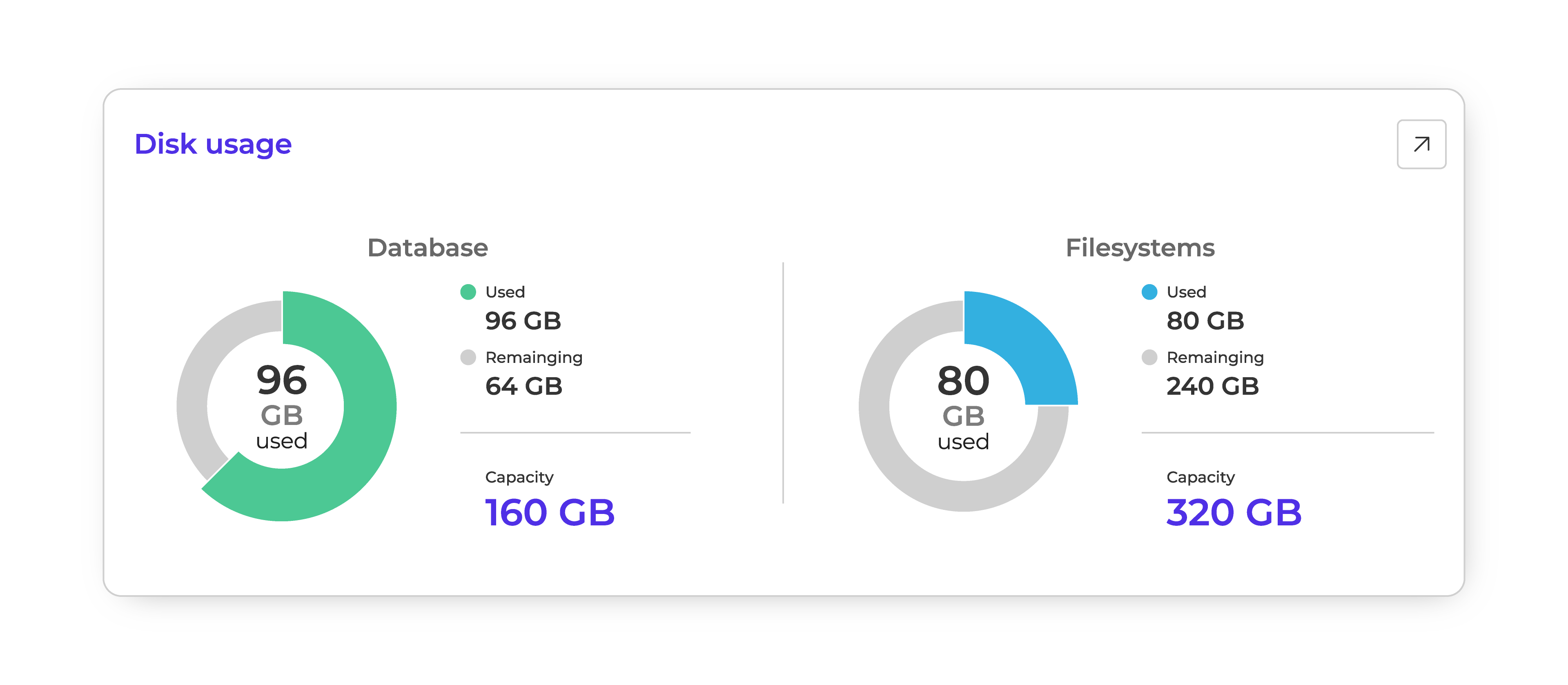
The dashboard breaks down how much database and filesystem storage is in use versus what remains. This makes it easy to see when you’re approaching capacity and plan ahead—whether that means cleaning up unused data or expanding storage capacity. Instead of discovering space issues mid-operation, teams get an early indicator of when to act, keeping integrations running without disruption.
7. Credits
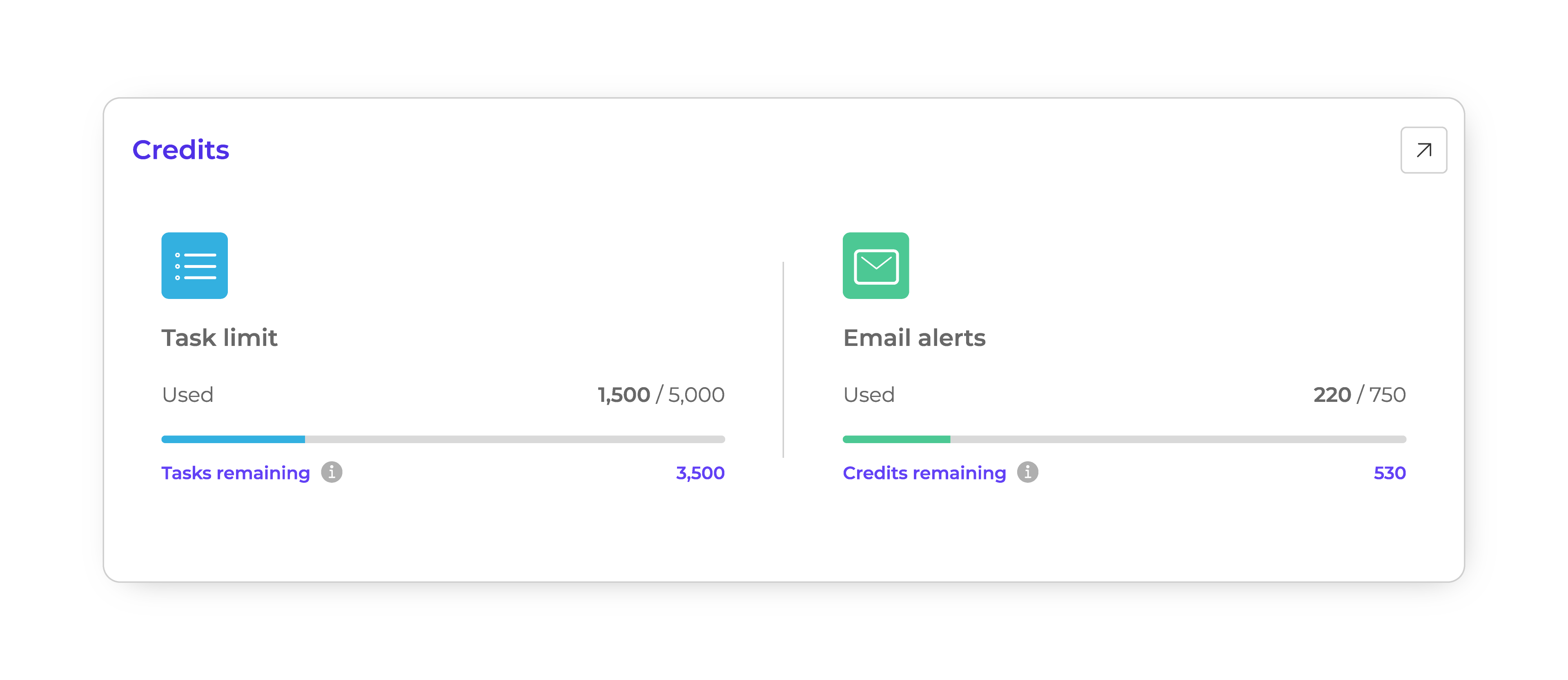
In Alumio, the Task execution limit (unless you have a plan with unlimited Tasks) and email alert notifications you trigger both run on credit systems. While these limits vary depending on your license, the Alumio dashboard helps you track how many credits you’ve used and how many remain, so you know exactly how much runway is left. This foresight helps teams adjust workloads, schedule heavier jobs smartly, or optimize how error notification email alerts are scheduled.
Now that we’ve covered all major elements on the Alumio dashboard, let’s explore the navbar at the top to understand the various connection methods, integration tools, access controls, and more.
.svg)
.svg)
.svg)
.svg)
.svg)
.svg)